Field Note 03- Low Tide, High Drama
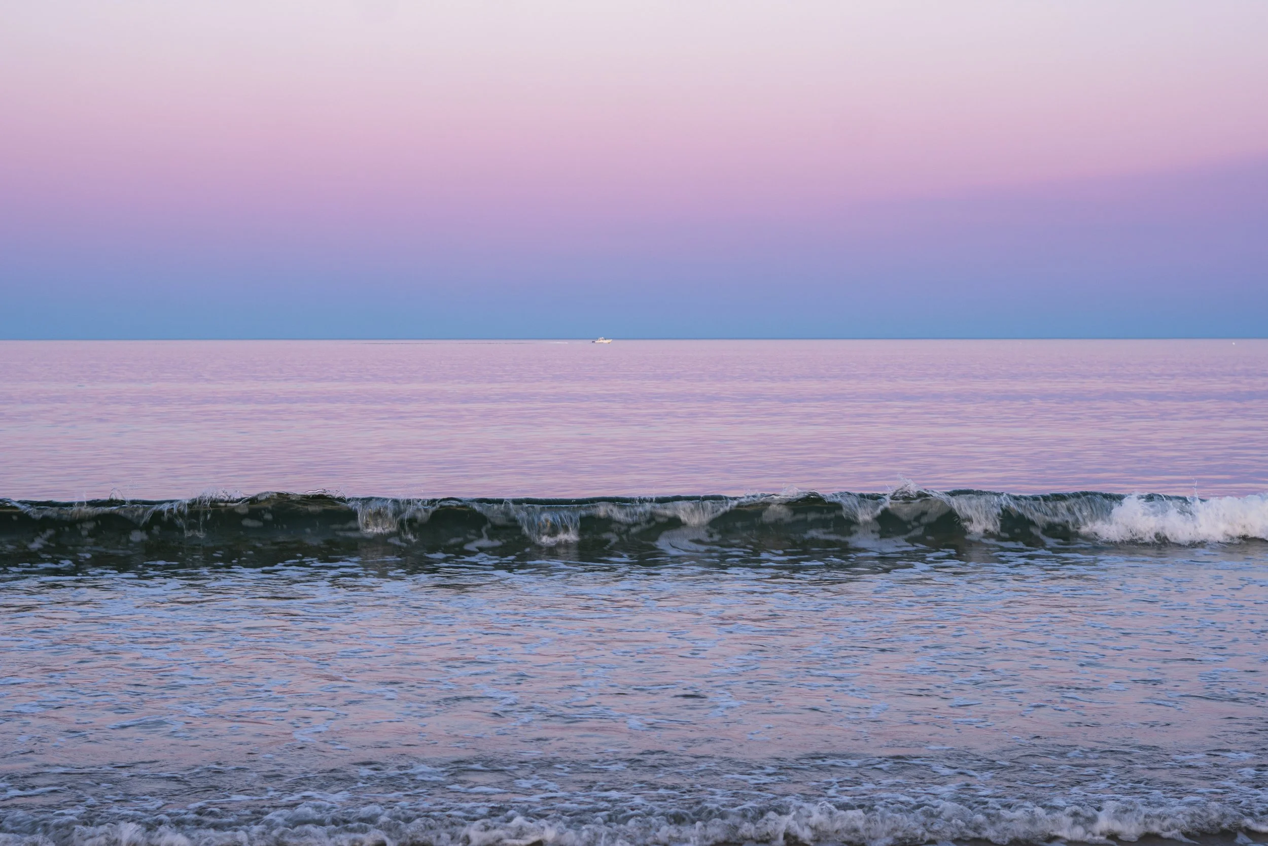
The evening started out as a very normal night at the beach while my father-in-law and his partner were visiting my fiancée and me. Anna and I go to Ocean Park often, for açaí in the morning (shoutout Books and Bowls), and for golden-hour reading and cuddling sessions on the beach, so I wasn’t expecting to make anything particularly serious that night.
I only brought my camera because I bring it almost everywhere, which is occasionally annoying right up until the exact moment it becomes completely necessary.
I figured I might take a few photographs of Anna and her father, maybe some of everyone throwing the football around, and call it a night. I just wanted to capture some photos of the people I love being happy, nothing fancy.
Instead, the light completely took over.
By the time we crossed the green dunes and reached the shoreline, the sky had settled into layers of lavender, blue, and muted pink. The tide was unusually low, leaving enormous stretches of wet sand exposed beneath it.
We all stopped. The entire beach was reflecting the sky back at us. Mike & Janice, being from FL, also could NOT believe that the sand was cool to the touch.
It was one of those scenes that looks almost suspiciously beautiful in real life, the kind that makes everyone gasp at once and makes me immediately stop participating in whatever social activity was happening five seconds earlier.
That combination of blue-hour light and reflective sand is what created the soft, almost weightless quality I was drawn to in these photographs.
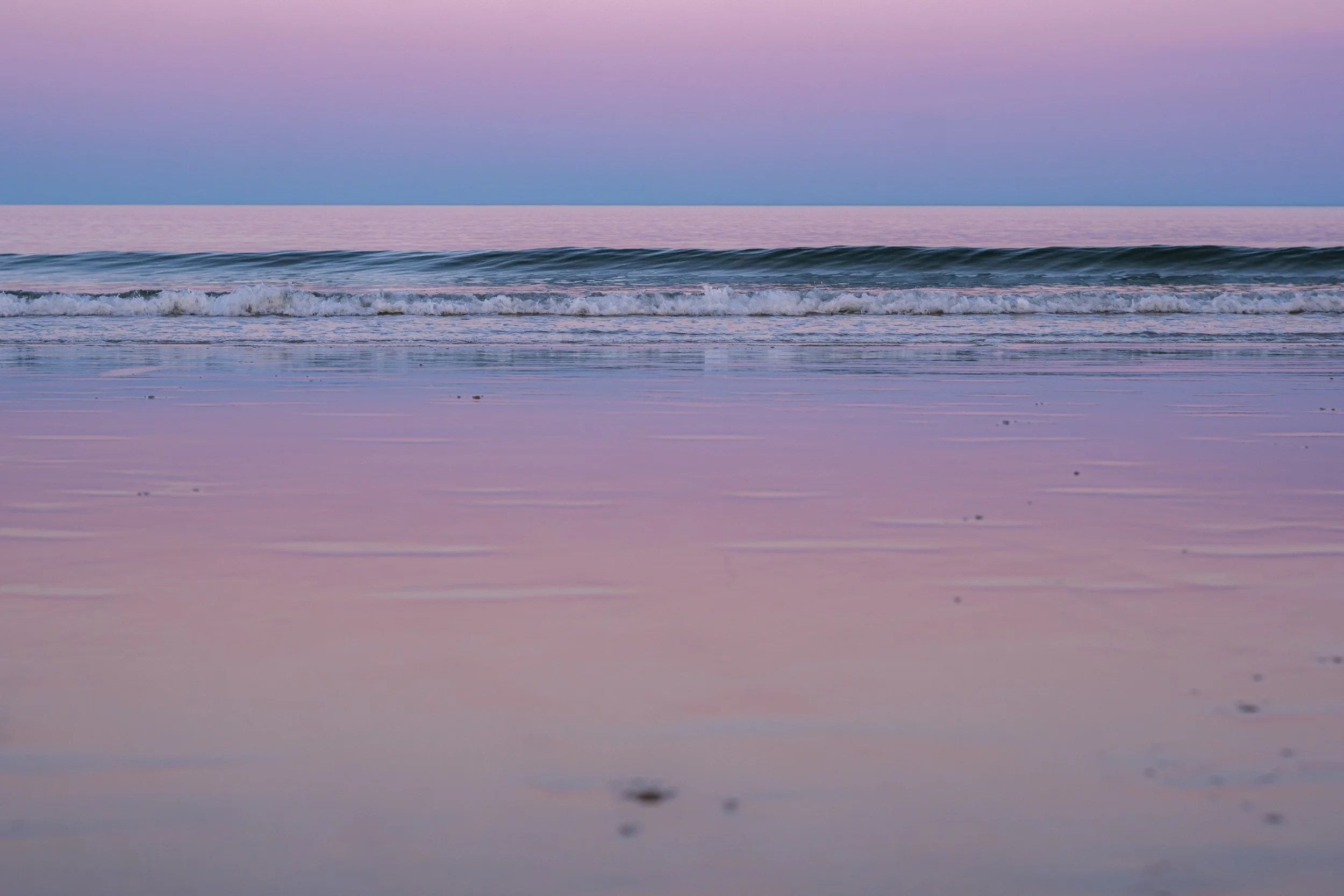
everyone else: omg pretty! me: guys look at that tonal separation
Rather than filling the frame with people, I started looking for negative space, tiny silhouettes, clean horizons, subtle tonal separation, and the strange little textures and geometries the receding tide had carved into the shoreline. The color was already doing enough talking, so I wanted the compositions themselves to be relatively quiet.
Low tide was doing an incredible amount of the work for me.
As the water receded, the beach began functioning almost like one enormous natural reflector. Thin sheets of water across the sand picked up the color temperature of the sky and carried it all the way through the foreground, rather than leaving the interesting light confined to a thin strip above the horizon.
It quite literally took our breath away!
In some frames, the shallow tidal channels also created natural leading lines, drawing the eye from the foreground toward the water. I wasn’t particularly interested in finding one obvious object and declaring it the subject. I wanted the subject to be the color.
That presented its own compositional problem, though. When nearly everything in a frame falls somewhere between blue, lavender, and pink, the image can very quickly become one beautiful but completely indistinct pastel blob.
So I paid close attention to tonal structure. The darker sections of exposed sand gave me localized contrast and helped separate the reflective pools from the rest of the beach. Those small pockets of darkness are what give the photographs shape. They let the images remain soft and atmospheric without becoming visually vague or dull. Focusing on details in the movement of the water also allowed for interesting images.
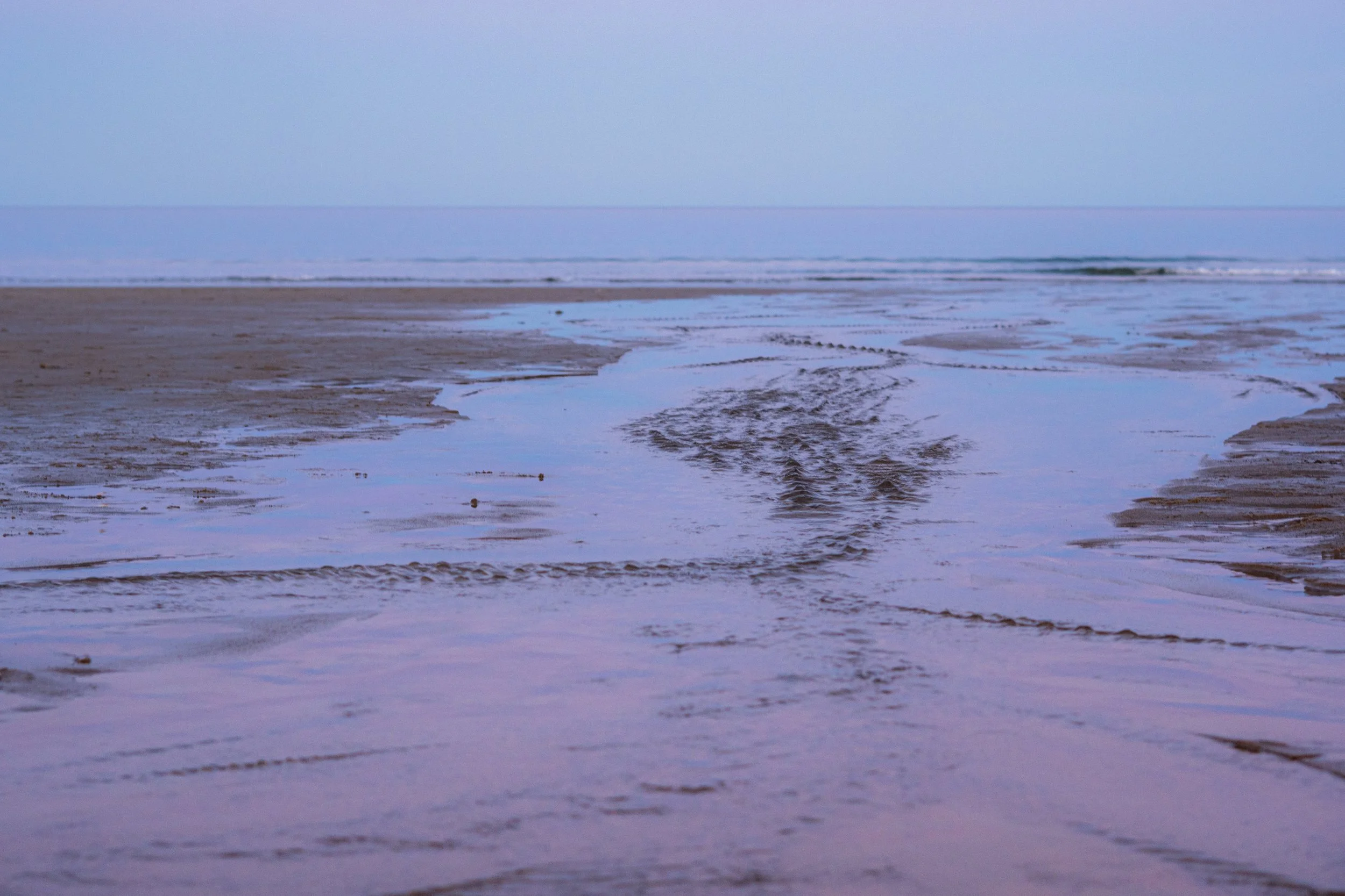
I think that tension is part of what makes these photographs interesting despite how simple they appear at first glance. There isn’t much happening in the traditional sense. No elaborate subject. No dramatic action. Just color, texture, repetition, and enough contrast to give the eye somewhere to go.
The white balance was equally important.
I wanted to preserve the cooler ambient light of blue hour instead of warming the files until they resembled a more conventional sunset. There was still pink light hanging near the horizon, but the rest of the beach had already shifted decisively into blue.
Keeping that cooler color temperature allowed the pink and blue to exist beside one another instead of blending into a general warm glow.
That blue-magenta separation is really where the cotton-candy quality comes from.
I was careful with exposure for the same reason. Pastel skies are surprisingly easy to ruin. Push the highlights too far and the subtle transition between lavender, pink, and blue disappears into a bright, vaguely pleasant nothing.
So I prioritized preserving the gradients in the sky rather than trying to make everything look immediately luminous in-camera. That gave me room in editing to lift the darker portions of the frame while keeping those tiny shifts in color intact.
The final approach was mostly an exercise in restraint: soft contrast, protected highlights, minimal compositions, large areas of negative space, and just enough structure from the shoreline to keep everything grounded.
Which, unfortunately for anyone hoping to throw a football with me, meant that I became completely useless for the next several minutes.
Because blue hour is incredibly short.
These photographs were made within roughly five to ten minutes (not counting waiting, cropping, culling, obviously).
Five minutes in which the pink became lavender, the lavender slipped further into blue, the reflections changed with every step, and the same stretch of beach seemed to become a slightly different place each time I raised the camera.
The lower the tide got, the less the beach felt like land at all. For a few minutes, it was just layers of reflective surface, texture, and color.
These photographs also became the starting point for In Passing, a short-form video series I’m making around the small, beautiful things that are easy to miss when you’re moving too quickly. Episode One was filmed here at Ocean Park during the same few minutes of blue hour, thirty seconds of tide, color, movement, and absolutely nothing urgent happening. Which, lately, feels worth paying attention to.